Professional Work
Data Modeling
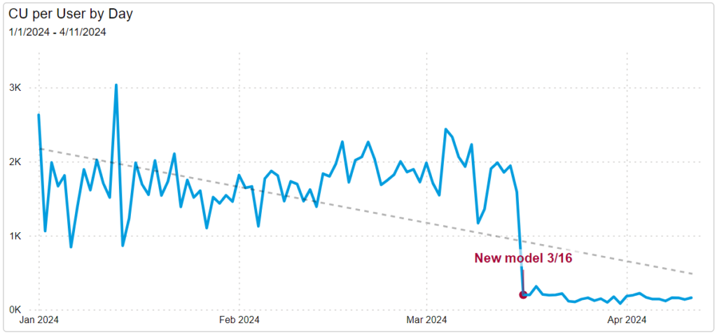
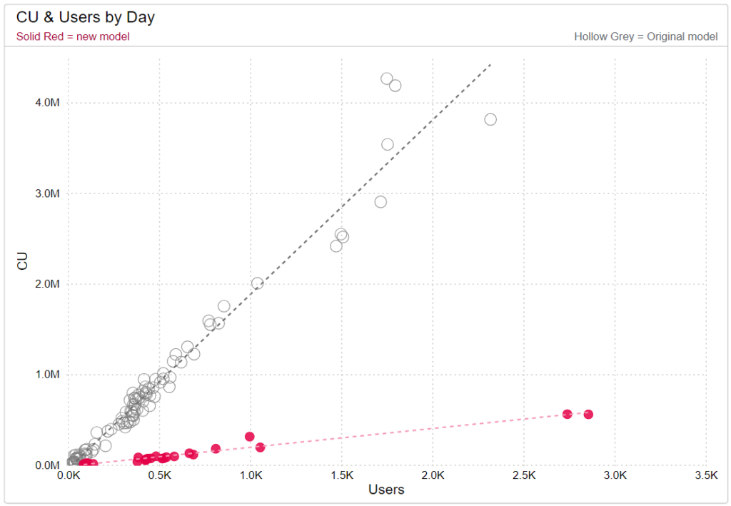
Optimizing Power BI data/semantic models is necessary for reports that are highly utilized and contain large amounts of data. In the project highlighted here, I worked with the report owner to redesign the model from the ground up. This dataset was consuming a large percentage of the organization’s production workspace capacity units (CU), causing organization-wide throttling in the Power BI service. The redesign was effective; the new model is a quarter of the size of the original model and uses approximately 14% of the original model’s CU without changing any of the report functionality or data. This effect was achieved by utilizing a star schema and removing snowflaking tables, modifying relationships so that many to many and bidirectional relationships were eliminated, removing data not used in the report, removing calculated columns, turning off auto date/time, and optimizing the DAX measures.
The charts below demonstrate the significant drop in CU after the new model was published. The line chart shows the drop in CU per user while the scatter plot highlights the CU difference in days with similar user counts.


Training
I have experience advising Power BI developers on modeling, DAX, and visualization best practices. Below is one page from a sample report I developed and presented to new developers to introduce the capabilities of Power BI (cross visual filtering, drill through, tooltips, etc.). The pbix was shared with these developers and accompanied by materials and instruction on getting started with Power BI.
Higher Education Reports
The following is a series of publicly available reports I developed during my time at Penn State University. My last updates were in the spring of 2022 and are reflected in the videos below.
This was the first Power BI report used to present research data for the University. Previously, an annual report was published to the web as a PDF.
It was important that this report clearly present the data as two separate entities, because the data reported to and sourced from the National Science Foundation (NSF) is not the same data used for the internal report.
For this project I used Python to automate the steps of merging and transforming the NSF CSV files before importing them into Power BI. Charticulator was used to create the rank (bump) and the field matrix visuals.
A major challenge in this and other reports in the series was creating a way for users to view the intersection of variables on the demographics pages. I developed the reports before the introduction of parameters in Power BI so I relied on DAX and inactive relationships to create this functionality.
One tricky component to this report was forcing the percentage point change on the summary page to display only when the cohort year and graduation time period selected by the user was populated with data. Working through this helped me refine my DAX skills.
One part of this report that worked well was the degree type display of both trends and distribution. The bars below the line charts give users quick insight into the relative size of each degree type. Users can also hover over the bars to view proportions by year in addition to the counts visible in the line charts. The dynamic titles showing change over the time period provide additional detail.
This report provided a welcome challenge as it delved into HR data which was a new focus area for me. Prior to this, the majority of my work was directly or indirectly related to student data.